Visualizing data with Pandas and Plotnine
Overview
Teaching: 40 min
Exercises: 50 minQuestions
How can I visualize data in Python?
What is ‘grammar of graphics’?
Objectives
Describe the features of pandas built-in plotting abilities vs. using external packages.
Create simple scatterplots and histograms with pandas.
Use plotnine to customize the aesthetics of an existing plot.
Build complex and customized plots from data in a data frame.
Export plots from Jupyter to standard graphical file formats.
Visualization in Python
Matplotlib
![]()
We are going to demonstrate how to the built-in plotting tools that come with Pandas, but these functions essentially “wrap” matplotlib code to produce graphs. Even Plotnine, the ggplot-like library we’ll use later, is built on top of matplotlib.
%matplotlib inline
Pandas plotting
import pandas as pd
gh_url = 'https://raw.githubusercontent.com/datacarpentry/R-genomics/gh-pages/data/Ecoli_metadata.csv'
ecoli = pd.read_csv(gh_url)
ecoli.head()
| sample | generation | clade | strain | cit | run | genome_size | |
|---|---|---|---|---|---|---|---|
| 0 | REL606 | 0 | NaN | REL606 | unknown | NaN | 4.62 |
| 1 | REL1166A | 2000 | unknown | REL606 | unknown | SRR098028 | 4.63 |
| 2 | ZDB409 | 5000 | unknown | REL606 | unknown | SRR098281 | 4.60 |
| 3 | ZDB429 | 10000 | UC | REL606 | unknown | SRR098282 | 4.59 |
| 4 | ZDB446 | 15000 | UC | REL606 | unknown | SRR098283 | 4.66 |
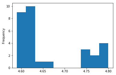
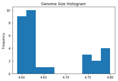
Pandas Histogram
ecoli['genome_size'].plot.hist()
ecoli['genome_size'].plot.hist(title='Genome Size Histogram')
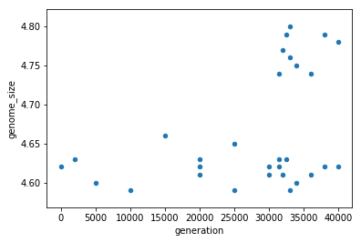
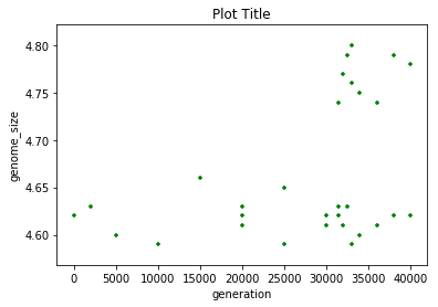
Pandas Scatterplot
ecoli.plot.scatter(x='generation',y='genome_size')
ecoli.plot.scatter(x='generation',y='genome_size',
                   title='Plot Title', c='green', marker='+')
Grammar of graphics with plotnine
Python has powerful built-in plotting capabilities such as matplotlib, but for
this episode, we will be using the plotnine
package, which facilitates the creation of highly-informative plots of
structured data based on the R implementation of ggplot2
and The Grammar of Graphics
by Leland Wilkinson. The plotnine
package is built on top of Matplotlib and interacts well with Pandas.
Just as with the other packages, plotnine need to be imported. It is good
practice to not just load an entire package such as from plotnine import *,
but to use an abbreviation as we used pd for Pandas:
import plotnine as p9
From now on, the functions of plotnine are available using p9.. For the
exercise, we will use the surveys.csv data set, with the NA values removed.
Plotnine Histogram
(p9.ggplot(data=ecoli,
           mapping=p9.aes(x='genome_size'))
    + p9.geom_histogram()
)
/Users/miketrizna/miniconda3/envs/python36/lib/python3.6/site-packages/plotnine/stats/stat_bin.py:90: UserWarning: 'stat_bin()' using 'bins = 3'. Pick better value with 'binwidth'.
  warn(msg.format(params['bins']))
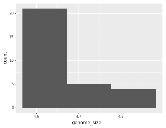
<ggplot: (7561237964)>
(p9.ggplot(data=ecoli,
           mapping=p9.aes(x='genome_size'))
    + p9.geom_histogram(bins=15)
)
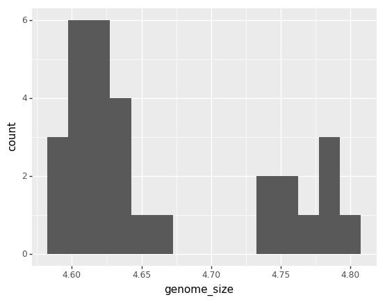
<ggplot: (7560944062)>
Plotnine Scatterplot
(p9.ggplot(data=ecoli,
           mapping=p9.aes(x = 'sample', y= 'genome_size'))
 + p9.geom_point()
)
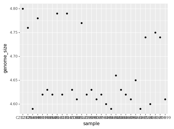
<ggplot: (-9223372029321576718)>
(p9.ggplot(data=ecoli,
           mapping=p9.aes(x = 'sample', y= 'genome_size'))
 + p9.geom_point(alpha=0.5, color='blue')
 + p9.theme(axis_text_x = p9.element_text(angle=45, hjust=1))
)
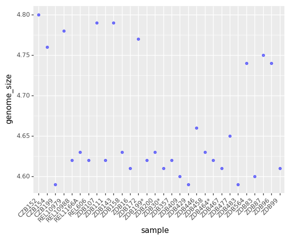
<ggplot: (-9223372029308153123)>
(p9.ggplot(data=ecoli,
           mapping=p9.aes(x = 'sample', y= 'genome_size', color='generation'))
 + p9.geom_point(alpha=0.5)
 + p9.theme(axis_text_x = p9.element_text(angle=45, hjust=1))
)
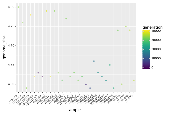
<ggplot: (7546764513)>
Key Points
The
data,aesvariables and ageometryare the main elements of a plotnine graph